Tuesday, December 31, 2013

2013 Was Outstanding

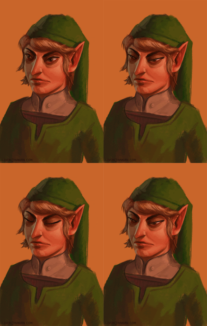
A bulk of the work I made in 2013.

Wow, it's been an interesting year for me. Thanks to everyone who worked with me, supported me, "liked" my art on facebook, bought a skull mug, and otherwise inspired and encouraged me to live my dreams. So many things happened! I think this calls for a bullet list.
  • When 2012 ended, I had had enough of working as a web designer. The work itself was fine, but working as a full time designer, I got tired of being laid off. If I was going to be poor, I might as well be poor doing what I wanted, so I bought a new tablet and made the resolution that 2013 was the year I would become a professional fantasy illustrator. No distractions, no baloney.
  • And it happened! 
  • I made a bunch of work, some better than others (see above). In previous years, I would consider myself lucky to finish 1 painting every few months. The above image doesn't even include much of the work I've done in the last couple of months!
  • I went to Illuxcon, not knowing anyone or anything about it, and met some great people. The fantasy illustration community is such a positive and supportive group! I think there is a love and appreciation of each others' work that isn't as strong in other related fields. I also got to meet and got feedback from incredible art directors Zöe Robinson, Jon Schindehette, Lauren Panepinto, and Marc Scheff. As well as living legends Jeff Easley and Donato Giancola (and many more!!!). I was hesitant to go, but it was very much worth the trip and one of the most valuable investments i've made in my life.
  • I got a wake-up critique from the afore-mentioned Jon Schindehette, which led me to make better work and to write an article about rejection that led to a feature in Imagine FX.
  • I got a job at a major animation studio working on a(n amazing) secret project.
  • I got to work with THE R.A. Salvatore on a project, and he sent me an e-mail!
  • I got to make a contribution to the Whedonverse! (I'll post more about that later!)
  • My daughter grew up leaps and bounds, and I was able to be there with her, working half time and being a dad the other half. Something that wouldn't have happened if I was at a 9 to 5 job.
Looking forward to 2014, I just want things to keep going how they're going, so I guess here's a list of some of my goals:
  • Ramp up on painting in oils again.
  • Get to work on Dungeons & Dragons.
  • Make at least 8 personal pieces.
  • Do a book cover.
  • See a movie in a theatre.

Thursday, December 26, 2013

Happy Holidays!


 I hope you're having a casual post-christmas. I finished my yearly painting in a series I call "Alpha Santa", where I like to imagine Santa shaped by the harsh-environment of the North Pole. This one is called "God Emperor of Christmas". This year, as a departure from the last two years, I wanted to show him in a religious, reverent way. So I went with a centered composition, inspired by this painting from William-Adolphe Bouguereau.

The Motherland - by William-Adolphe Bouguereau
I've been thinking of what to do with the elves for a while, now. They are implied by the arrows in "End of the Hunt I" (the one with the yeti), and last year's painting with Rudolph was originally going to be Santa knife-fighting with the king of the elves. I have purposefully kept from doing to much research into various elements of the Santa myth (like why he gets to boss around a magical race of little people) because I am pretty certain I'd like my own version better.


Planning the composition was really fun. I decided to approach it very formally, placing elements in a very deliberate manner according to two inverted golden rectangle cascades. The result was a symmetrical (both vertically and horizontally) picture, where I got to have a lot of figures and elements. It was a very fun painting to execute. It was also a good opportunity to switch it up from the tilted-action perspective illustrations I worked on for the last 2 months.

Here are the last 2 years' Santa paintings. I like seeing how i'm slowly getting better over the course of time.

Monday, October 14, 2013

What the Highlander Taught Me About Being an Artist


Editors note: The highlander in reference is the One True Highlander, Duncan Macleod (played by Adrain Paul), not that pretender Connor (played by Christopher Lambert). This is a controversial topic which I won't go into any further. Please enjoy the rest of the article.


1. Style is something you cultivate, not obtain.


Duncan didn't pick out his katana on Amazon.com based on reviews and ratings, it was crafted and given to him by a powerful Japanese sensei. He didn't drive down to TJ Maxx and pick out a ponytail brooch because he kinda liked how it looked on some other highlander. I don't know where he got that sick ponytail brooch. Probably it was a gift from an Irish princess after a week of love making and adventure. His fine blouses were probably all made from silk that came from silk worms he raised for generation after generation since obtaining them in China in the late 1600s. The point is, Duncan's style stemmed from his experience and past. Not from what he hoped to be in the future.

2. You are never done learning.


Every episode had a training montage, because Macleod understood that you can always forget, but you can never stop learning. This gave him a great advantage over other immortals who stopped learning how to sword fight and divided their energy with other useless skills like pantomime or video games or writing blogs. All masters know this, but it's hard for us to see because we don't have the vision that they do.

3. Do not underestimate the importance of friendship.


The underlying rule in Highlander is "there can be only one", but Duncan Macleod always gave second chances, and even rescued immortals who would have taken his quickening given half the chance. Often, these immortals returned to help him when he was at his lowest, even saving his life from time to time. Putting yourself first without helping others is a good way to isolate yourself, and people will surprise you with what they have to offer when you least expect it. So pass on your knowledge and support, and some great things will come your way. It's not just about being the best, you should also strive to elevate the playing field.

4. Some rules are sacrosanct.


Never fight on holy ground, and never be late on a deadline.

5. Love often, love hard.


We've all done it. Maybe the deadline was too short and you gave yourself too many projects, or maybe you phoned it in because the pay was low. But regardless of the woman, Duncan Macleod always poured every ounce of himself into his love making, regardless of whether it was a one night stand with the Duchess of York, or a romantic evening with his life's greatest love (Tessa-something). It's important to always set the priority to be whatever project it is at hand. If a project is too small, don't take it. But if you do take it, give it everything you've got.

6. Imbue your tools with the essence of your soul.


Duncan's sword was made with the greatest of care by history's finest Japanese bladesmith and it withstood decades of abuse. But Duncan could have bought it from Wal-Mart and would still be able to defeat even the most powerful immortal, because despite your tools, it is what you bring to the artist's table from within -- the skills, experience, ideas, and practice -- that make you the artist that you are. Granted, using the right tools is also important, but even the greatest tools are nothing without the right person to wield them.

7. Carry on.


Many see Duncan Macleod as sort of an infallible Adonis, but we all know that he struggled with loss and doubt. What set the Highlander apart was his willingness to pick himself up and carry on, even after being discarded by his clan, losing Darius and Tessa, and even having to kill his demon possessed protege, Richie (spoilers). The best of us experience failures and set backs, and some of the greatest artists I've known have almost quit painting after periods of struggling, but those who become masters are those who are able to persist.

Thursday, September 05, 2013

9 Things I've Learned About No

drizzt beholder
My newest painting, "Eyes of the Underdark", based on applying some of what I learned from an important critique

I recently had the opportunity to get an in-depth portfolio review from Jon Schindehette, and I jumped at the chance, because my life-long dream is to be among the artists who inspired me to become one. That is to say, I want to be an artist for Dungeons and Dragons. The review was honest. Brutally honest at times. He pointed to enough flaws to rival even my own harsh inner critic. It's not easy to be told to study the masters when you've been out of art school for 10 years. His 2-page e-mail ended with "Got any specific questions for me?"

Well, I did have some questions, but there was one question that stood out among the others. It was a question with a seemingly obvious answer, but nevertheless I felt compelled to ask it: "Is there any project now or in the near future that we can work on together?"

I'll stop the story there, and jump to what I want to talk about, and that is the word "No." Specifically, I want to talk about the various things I've learned from various people and experience over the last few years.


1. Stop Avoiding No

Often, in order to avoid the No, we simply don't ask. We play out the scenario in our heads like a nightmare, and wake ourselves up just before the potential client says no. The problem with that is, of course, that even though it stamps out any possibility of a No, it also stamps out any possibility of a Yes.

2. There's a Bright Side to No.

A No usually comes with reasons. These reasons are a sign post. They are a gift. Essentially the client is telling you what exactly you need to do to get a Yes. Where before you were operating on limited information, now you're hearing from the horse's mouth what you need to do. All that is left now is for you to do it.

3. No Sets the Price of Carrying On.

Sometimes you realize that the things you have to do to get a Yes aren't worth it to you. This is when you know it's time to quit, or to pursue a different avenue, or do something completely different. This is perfectly OK. There are those who would make you feel ashamed of this, but that's about them and nothing to do with you.

4. No is temporary.

No means not yet, or not right now. You might even say that No means "yes, but later". This is not to say you should harass a client until they say yes, but use this opportunity to construct a map to where you need to go. Study the masters. Get feedback on those thumbnail sketches. Focus on anatomy.

5. No is not about you. 

No is not saying you're a bad artist, or a bad person. Don't get defensive. No is about the person who is saying no. If I asked you for a thousand bucks right now, would you say no? Would it be because I'm not worthy of your money? Or would you be more concerned with your rent, your bills, that Chinese back scratcher you wanted to buy? By the way, if you want to give me a thousand bucks, I'd greatly appreciate it.

6. Dare yourself to ask.

You can turn your fear of rejection into an adrenaline rush. I've done it. It's addicting. You didn't sit on the sidelines like you always do. You went for it!

7. Love the No, Expect a Yes.

Sometimes you feel like you deserved a Yes. There are a lot of people who always feel this way. They are called by many different names but what really matters is that they get more Yesses than you. They get more Nos than you, too. Which leads me to...

8. Yes=1, No=0. 

This means that if you ask 1000 people, and 975 of them say no, you still have 25 yesses. If you ask 20 people, and 100% of them say yes, that's still fewer yesses. For many of us, though, we overvalue the No so it counts as -1. Move past this notion.

9. Use the No as Fuel. 

Wear that No with pride. In the last few years, I've been rejected too many times to count. I use this as motivation. I no longer ever say to myself, "maybe you're not working hard enough." When I do get a yes, it always feels well deserved. I have a mountain of skulls beneath me, each skull representing a rejection, that prove how hard and high I've climbed.

    I don't mean to come off as preachy, but I see the fear of No affecting a lot of incredible artists. It's those people that I hope these observations will help, because the world will be a better place if the good artists step forward to rival the ambitious artists.

    Thursday, August 15, 2013

    Seven Ravens Redux


    One of my earliest digital paintings was of a scene from The Seven Ravens, by the Grimm brothers. It was done for an Art Order challenge, and at the time I was really proud of it. In the 2 years since, my priorities in illustrating have shifted from "stark and symbolic" to "evocative and emotional". The failings of the old version come from mainly being unable to focus on what I wanted to say and how I wanted to say it. I just had a vision of the main character, surrounded by her transformed brothers. In the story, they aren't described as being giant, but I thought it would add some menace to the piece. In hindsight, maybe it just reminds me too much of Big Bird? Marc Scheff, in a critique, nailed it by saying that it was riding the line between wanting to be an editorial illustration and a fantasy illustration. There were, however, aspects of the the picture that I loved and wanted to keep -- Mainly the way I painted the birds. So, 2 years later, I wanted to fix this picture but the only way to do it was to start over.


    In the revisited version of the picture, The elements are similar but the setting has changed. The harsh sunrise wakes her up and sheds light on the looming tree. In the story, her meeting with the birds actually happens in a castle (where she must chop off her finger to get inside. yech.) but I wanted to push the idea of the girl being alone, away from home, and anguished from the guilt of her consequences of her childishness. The story is kind of harsh toward kids, especially in this day and age. But I can relate, because I often felt a lot of shame when I was a kid. I wanted to push the picture away from being too baroque and gory, toward conveying the more subtle internal dialogue of the main character. I hope I succeeded.

    Wednesday, May 22, 2013

    Great Strides Painting completed!


    I posted about a drawing giveaway a few weeks ago. I'm happy to say that the painting is finally dry enough to scan! Congratulations to the winner of this skull painting! Thank you so much to everyone who contributed. I made a total of $230!

    Tuesday, May 21, 2013

    5 Paintings That Suck: Getting Over Creative Block


    Last month I hit a wall. It's a wall that every creative person bumps up against from time to time. Before that, things were going great. I was churning out painting after painting, and each one, I felt, was better than the last. It felt like it would be a matter of months before I was finally at the level that I always wanted to be. The only thing I was worried about was that I'd get so good that I'd run out of things to learn.

    This one could have used more thumbnailing and more cohesive reference.

    Please stop laughing.


    I actually really like this self-portrait. I guess I can use it as an avatar?

    Well of course, when you learn a lot at once, something happens. Flaws that you never noticed suddenly become glaring and unavoidable. You start seeing better, which means you start seeing how great your paintings aren't. This is what's happening to me right now. It's hard to explain unless you're going through it or just recently went through it. I think that's why a lot of students get so frustrated and give up.


    All of my best sources and instincts tell me that I have to work through it, and that's what I'm doing. I'm trying to get myself excited that this is the precursor to a big boost in my ability. But for the time being, I'm just making stuff. I won't explain why, but the truth is that none of these pieces are portfolio-worthy, but they're each a step out of this rut.


    Monday, April 22, 2013

    Great Strides Drawing Giveaway!


    Hey folks, This is my last week of raising money for Great Strides Cystic Fibrosis Foundation. I'm walking on Saturday, and I'm really far from hitting my goal! So I'm offering a free drawing painting to one of my donors. For every $10 you donate, You'll get a chance to win a drawing painting done by me, for free! and if I make more than $200, it'll be a painting!  Update: We hit $200! (note: It won't be the painting shown here). 

    The more you donate, the more chances you have to win. Also, that same $10 will enter you into a drawing for 2 free disneyland tickets?!?!?!?! that's crazy. Click here to enter: http://www.cff.org/Great_Strides/LevonJihanian7040.

    DEADLINE: Friday 26th, 2013, 3pm PST

    Some info on Cystic Fibrosis:  Cystic fibrosis (CF) is a life-threatening genetic disease that affects the lungs and digestive system. Just two generations ago, most children didn’t live long enough to attend elementary school. Today, nearly half of people with CF are age 18 or older. Impressive progress has been made, but so much more needs to be done, as we continue to lose precious lives to this disease every day.

    Friday, April 05, 2013

    Process: The Coil Tightens


    A couple of weeks ago I posted this variant cover for Henry & Glenn Forever & Ever #2. I thought I'd go over my process for it, including the back and forth between me and the editor/publisher/art director for the book, Tom Neely.

    My initial instructions were to depict Henry and Glenn as warriors fighting something. This was both vague and right up my alley! I quickly drew up a couple of thumbnails:


    The one on the left was a standard contemporary book cover composition, which is deceptively simple, but hard to pull off. The thumbnail on the right was collaged together. I liked the idea of painting a horse, and it was more action packed. We decided to go with the horse, so I shot some quick reference and began the line drawing:

    We work with what we've got.
    I was getting close to finishing a tighter line drawing when Tom asked if it was possible to have them fighting a big monster. The giant snake is a great allusion to Conan, so I agreed. It also allowed for a more flexible composition. It was a bummer, however, to not get to paint a cool rearing black stallion. I'll have to save that for another painting.
    I really liked the physical story I was able to tell in the snake version. Henry and Glenn are simultaneously saving each other's lives, with Henry holding back the snake's jaws, and Glenn preparing to cut off its tongue. Originally, the plan was to have a textured white background, but Tom wanted something a bit more pulpy and less contemporary, with the characters in genre-specific clothing. I was happy to oblige and, being a child of the 80's, added a Masters of the Universe-esque background and some barbarian/knight attire.


    I brought my black and white roughs into color, got the go-ahead to dive in, and started painting in photoshop! Click here to see an animated gif showing the process. With the painting done, all that was left was to add some weathered paperback texture and create a title treatment.

    Final, with distress and lettering.


    This painting took me a longer time to finish than usual. It took a lot of iterations to nail down some of Henry's key features. One interesting thing about this piece is that it was entirely created digitally, including the sketches and thumbnails. Also, over the course of the last few paintings I've worked on, I've surprised myself at how much I now enjoy drawing and painting things that used to fill me with terror: namely, hands and rocks.

    Friday, March 15, 2013

    Henry & Glenn Forever & Ever #2 Cover

    Hey folks, I'm going to start blogging here a bit more often now, mostly with process & technique posts. I've spent the last few months re-vamping my portfolio and focusing in more on painting and fantasy illustration.

    That said, here's a cover that I finished a couple of weeks ago for the next issue of Henry & Glenn Forever & Ever!

    Henry & Glenn Forever & Ever #2 variant cover


    I hope you like it! I'm working on a process post for this painting and it will be posted up very soon! Below is the official promo for it, including the awesome official cover by Tom Neely.